Liqudity heatmap
Our heatmap shows the history of limit orders on the chart. Our algorithms select and classify the most significant limit orders. You can identify the largest limit orders using the filter.
Together with footprints indicator you may be able to determine whether the price level highlighted by the Heatmap will act as a price barrier and determine the absorption/exhaustion.
Filters
You can configure the display of limit orders on the heatmap using filters:
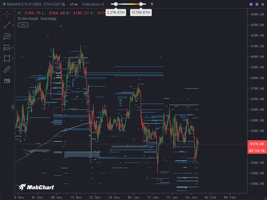
The left slider is responsible for filtering limit orders by volume, and the right slider is responsible for the color intensity of limit orders on the heatmap.
Filter customization
Sometimes on the heatmap, there are limit orders so large that the others, in comparison, will look equally small and have the same color on the heatmap.
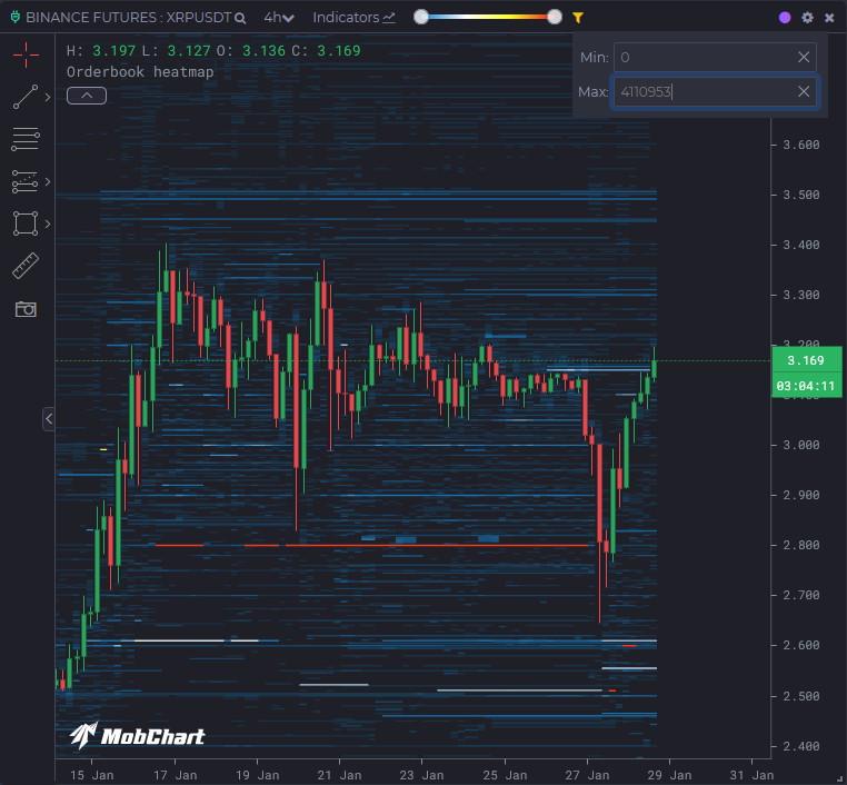
For example, on this chart, we see large orders for the XPRUSDT pair at the 2.8 USDT level
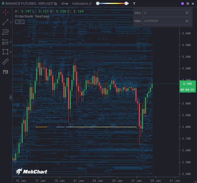
Because of this, it can be extremely inconvenient to read the heatmap, as we do not see the relative sizes of other limit orders.
But we can fix this by manually adjusting the upper filter limit. For example, on this chart, we reduced the upper filter limit from 41,109,539 XRP to 4,110,953 XRP (reduced by 10 times).
Now we can see the relative sizes of other limit orders on the heatmap: